New Table View for Wrike
Wrike is a versatile project management platform. Table view is the most popular and powerful view in Wrike, helping people to see and edit any data of their projects and tasks in a familiar spreadsheet-like UI. By 2020, the Table was slow, inconsistent with other views, and frustrating to use at scale. I led a full redesign that tackled the problem on three fronts: technical (partial loading to speed up huge datasets), architectural (merging Table and List into a single, consistent view), and UI (focusing on speed improvements for power users). The result was a faster, cleaner, more intuitive Table that reduced view-switching and became reliable again for large, data-heavy work.
Before this redesign I’d been working on Table for almost four years, improving it step by step. I routinely interviewed users to find out what they miss and struggle with, but by the end of 2020 almost every person I talked to mostly complained about performance: their tables were loading too long or might become too slow. It was a clear case of a UX problem turning into a serious business hazard, as some of our biggest and most loved customers were on a verge of churning because of this. I run several workshops with engineering, and we tried to find a way to solve the issues, but quickly realized that we couldn’t make Table as fast as our users demanded without completely rebuilding it. So we built a new version: faster, friendlier, and more powerful than before.
We started with a technical problem, and together with backend and frontend engineers redesigned our loading algorithm. All data is loaded partially now, which allows users to painlessly work with thousands of rows. While it was a huge engineering effort, my role was to understand and provide the right constraints: for instance, how much do we need to pre-load so users won’t wait too long and later won’t look at skeletons all the time?
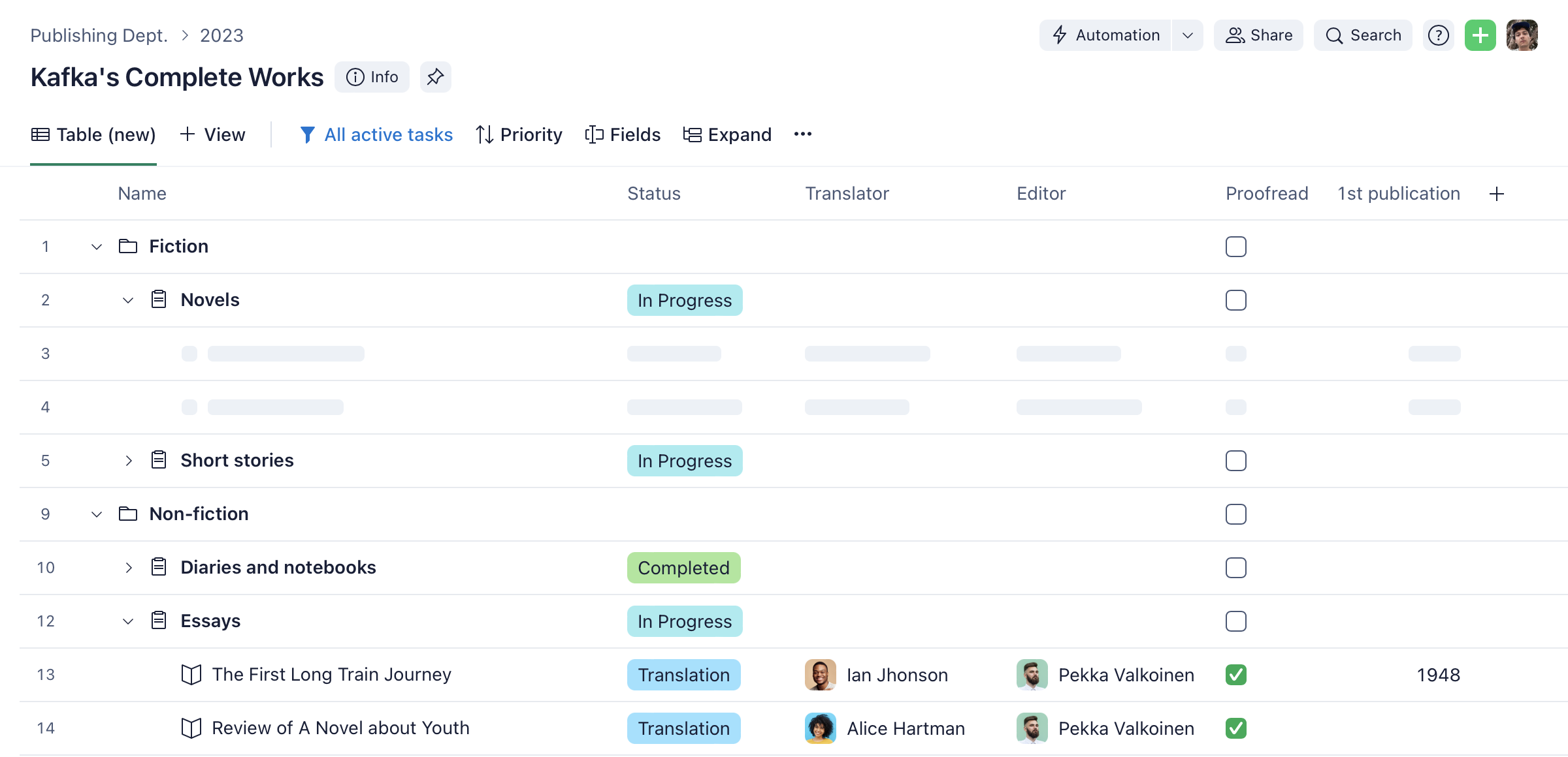
While interviewing users, I realized that one of the most time-consuming problems for them was switching between Table and List views: List provided access to unique features, but otherwise, people preferred Table. That’s why we decided to build a new Table as a List replacement suitable for typical users of both views. One example is a simplified way to view a row details: in a sidebar instead of an overlay.
Finally, I analyzed the usage data to understand what typical actions might be done faster. Cells are now edited with a single click, rows are added as fast as one could type. And as task details are opened in the side panel, one can easily copy and paste data from one part to the other.
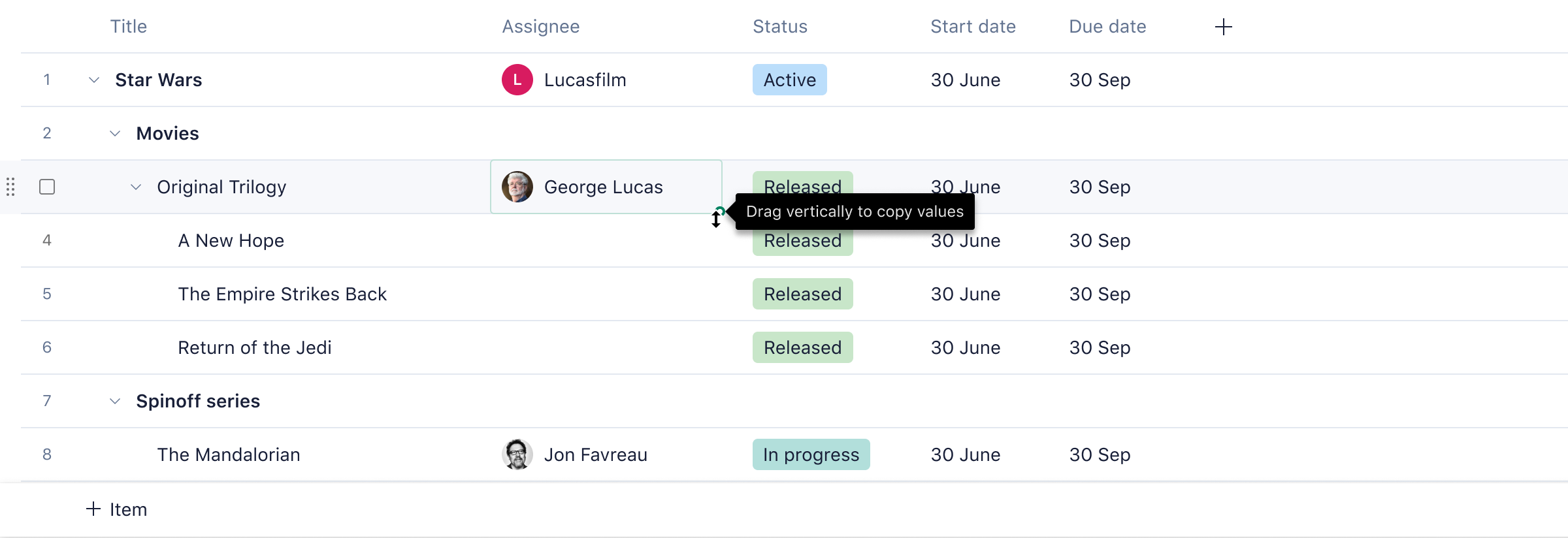
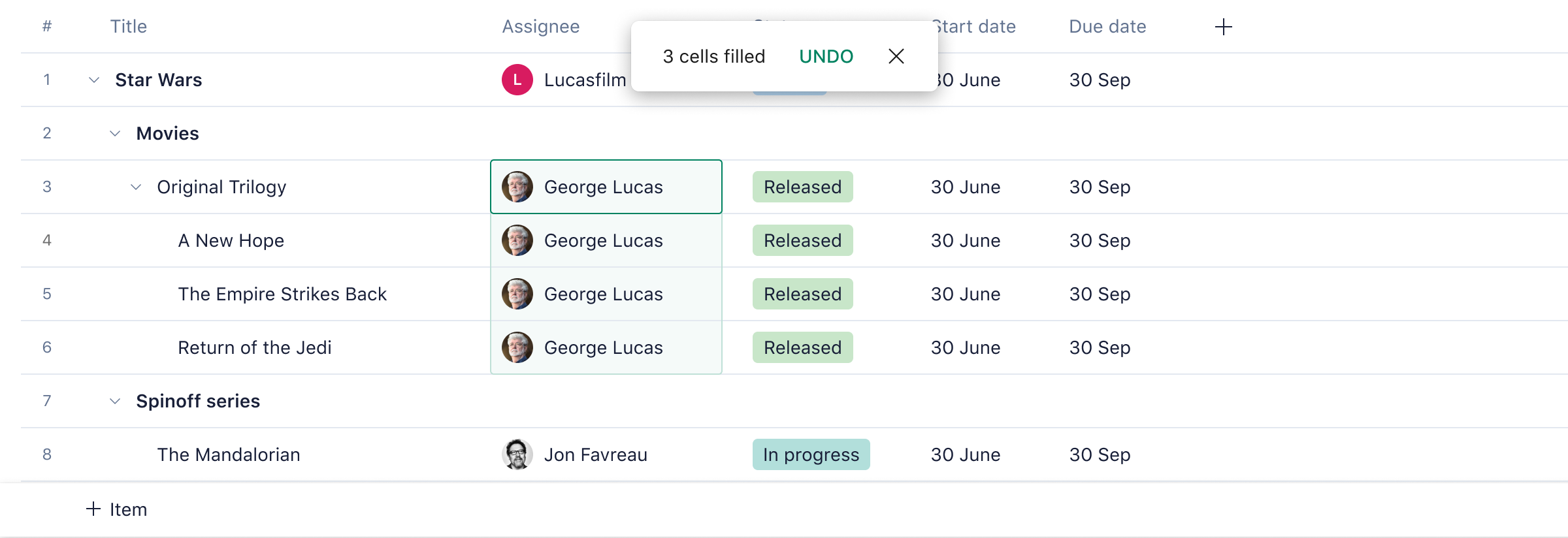
And of course, some classic spreadsheet features are also there. For instance, you can drag by corner to copy values, just like in Excel.
New Table is currently available to some Wrike users via a beta testing program. We get positive feedback about its performance, new features, and look & feel. We also see that our key metrics dedicated to a user’s speed of work are improved.