Filters Platform for Wrike
In 2024, I redesigned Wrike’s outdated filtering system – a core experience used daily across the product. Users struggled with even simple filtering tasks, while advanced scenarios were impossible. I run a series of interviews with experienced users to understand what functionality they miss and tested the existing UI with new users to find critical interaction challenges. Guided with these findings, I replaced the clunky old filters with a streamlined filter bar, introducing new features like sliding date ranges, and / or, exclusion filters and more. New filters were an immediate success between the existing customers and helped to improve the product adoption by new users. I built it as a reusable platform for different user scenarios and data types, and it later powered Automations, Dashboards, and Wrike’s new Datahub product.
The Problem
I first discovered the problem while working on Wrike’s Table view, where users manage large, spreadsheet-like projects. In interviews, both new and experienced users complained about struggling to find information in complex tables.
New users failed basic filtering tasks during UI testing sessions. People didn’t understand if any filters were applied, and even tasks like “See all tasks in Active status” were impeded by the old filters complex hierarchical structure.
Experienced users told us filtering didn’t work as expected or lacked key options. Many clients wanted to automate scenarios of seeing planned work (“Each sprint we need to manually look for the tasks with specific dates instead of setting up due this sprint once”). Others were struggling with navigating a portfolio of projects: “I want to find overdue tasks in multiple projects assigned to me – but I can’t filter by both at the same time”.
Analytics confirmed filters were heavily used across Wrike – making their poor usability a critical blocker. At the same time, the company’s OKRs emphasized improving new user engagement, and a new internal product (later launched as Datahub, a potential Airtable rival) required best-in-class filtering. All that made Filters strategic infrastructure.
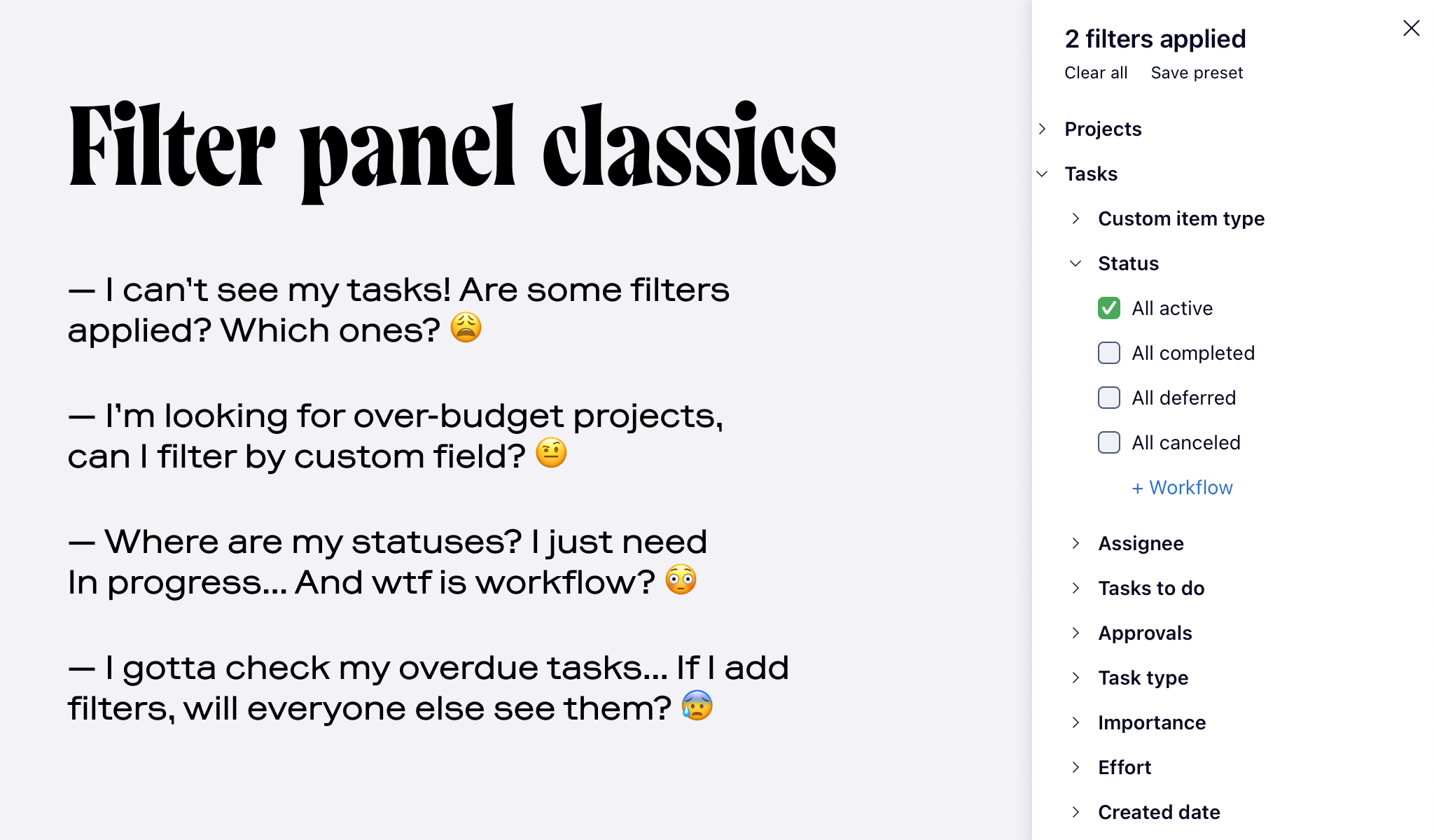
Some sentiments on the old filters that I heard from users. A slide from my presentation to the team
The Challenge
Filters were used in many different contexts – views, dashboards, and automations with tasks and projects; administrative tables with account users; and soon, Datahub with arbitrary customer data. Each had different data types, rules, and technical constraints. The challenge was to design one system that could:
- work across all these contexts with minimal tweaks;
- support advanced scenarios without overwhelming beginners;
- be easy for other designers to adopt and extend.
Discovery
I researched two main directions. First, I wanted to understand what existing requests could be solved with filters – even if the users themselves didn’t ask for filters improvements specifically. I analyzed all the feedback regarding the search for information and navigating in complex projects and project portfolios. When interviewing users directly, talking to our customer success organisation, and reading what people were asking for in the community forums, I heard several repeating themes.
- Planned work. People often use filters to see tasks due in repeating time intervals like sprints, weekly and daily to-dos, or quarter planning. Existing filters only allowed manual date selection, while many users expected to set a relative period like «due next week» or «completed last month» once and for good.
- Values exclusion. Two classic use-cases many managers shared were to see their team work without any tasks assigned to themselves and find tasks that are in any status but completed. Here the solution seemed obvious: some kind of a «not» operator – but was not available.
- Access to projects' data from task level. Whenever a project manager was looking for the tasks of a project she was running, it was impossible for her to understand . What users were asking was: «Let me quickly copy a value from a project to all the tasks in it» – and while a different team was working on this piece of functionality, I decided that filtering might help meanwhile: what if people were able to filter tasks by their projects' assignees, statuses, or other fields?
Focusing on these areas helped me to shape the solution: adding new functionality to the first version was justified be it useful for them.
Second, I needed to find the most critical issues with the existing UI. Together with the UX researcher, we ran several tests with people who’d never used Wrike before: we asked them to perform the basic filter scenarios – those most popular in our analytics' data.
This allowed me to focus on the issues mostly affecting new users, which was the company focus at the moment: the main metric was new users retention, and we hoped to improve it by making the basic features easier to use. It also helped to establish a benchmark for the new solution and validate it later on (obviously, it would have to perform better).
Solution
The filter bar. key issues with the existed panel were understanding what filters are applied and finding the ones you need at the moment. The new solution is built around a filter bar with built-in search. Applied filters are visible and easy to clear if needed. If users want to add more, they get immediate access to the fields they see as columns in the table, which are usually the fields they want to filter by.
The filter bar also works as the search input
The bar works the best for simple cases with a couple of filters, which make around 85% of all according to our usage data. However, it also supports more sophisticated cases when one needs to group several filters and find items matching any or all of the filters.
Another idea behind the input-based filter bar is AI-powered natural language filtering. This one is still under development as a part of larger product-wide initiative:
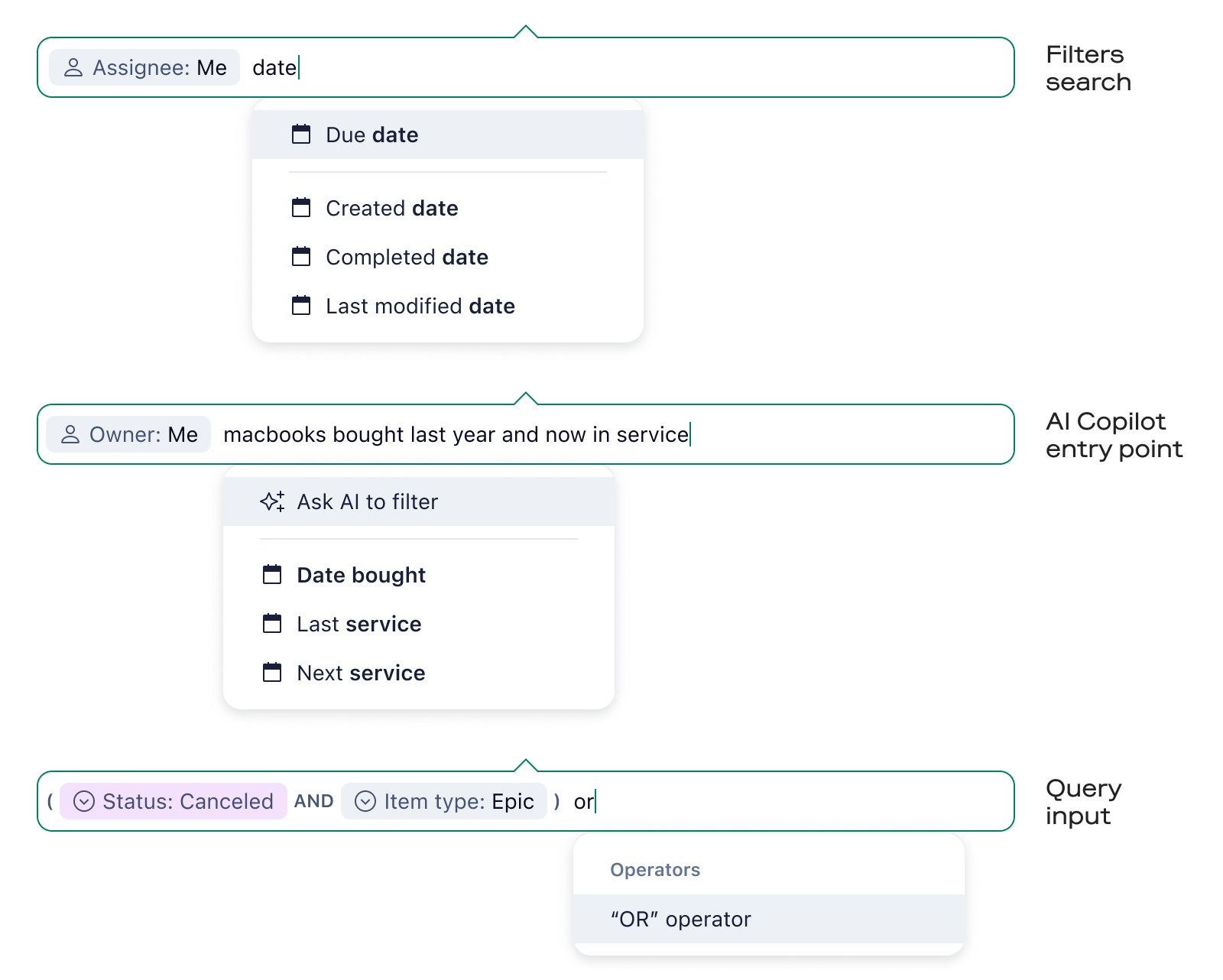
Three ideas behind making the bar an input
Consistent data types. I wanted to support existing and lay foundation for future filtering scenarios, both in Wrike workspace with tasks and projects and other contexts with different data model. I created a system where there's a standard filter UI for all data types available in the system: text, number, date, single- and multi-selects, checkbox (boolean type).

Filters of main data types. Filters for all specific Wrike fields are based on one of the types: eg, Assignee is multi-select, Status is single-select, Budget is number, and so on
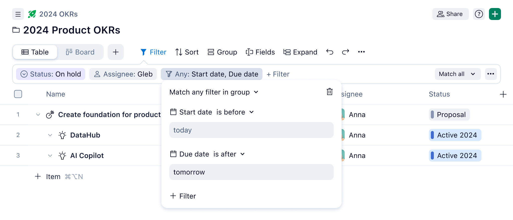
New features. One of the most anticipated additions to the filters was a more flexible date filter. The challenge was to make the UI clear for unexperienced users, but at the same time powerful enough for different scenarios I revealed in the feedback and interviews: catching up with quarter plans, planning daily and weekly workload, finding tasks completed last year, and so on.
Another long-awaited addition was an exclusion filter: the «is not» predicate was added to all filter types where it made sense. One of the use cases is excluding unnecessary statuses:
Using the new date filter and exclusion filter for status
The case when people needed to find tasks by properties of the projects was solved by the Parent filter. The initial idea was to create a universal multi-level property filter, allowing to target properties of related items and make complex requests like: «all tasks where assignee's location is Prague». However, after showing it to users I realized that we may start with a specific case that would solve the most common issue. That said, UI is made so it could be reused for a universal filter later.
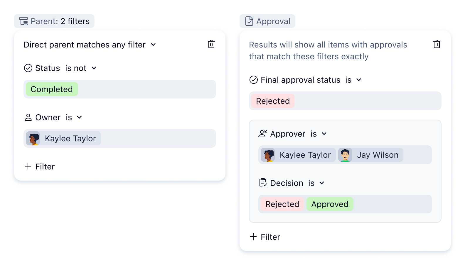
Complex filters like Parent and Approval target tasks and projects by the values of their nested or parent items: eg, helping to find tasks by its approval due date or project owner. Both are based on the same UI principles
Validation
To validate the solution, I organized testing on early stage, and later, together with the product manager, was analyzing feedback on the alpha version released to early adopters.
Benchmark Testing. To undertand if the solution is better for new users, I ran side-by-side usability tests with people unfamiliar with Wrike. The respondents were asked to perform the same basic tasks either in real Wrike UI with old filters or in a interactive prototype with the new filter bar that I've vibecoded for the test; each task was given a success rate. The new UI showed clear improvements.
Alpha Testing. I partnered with engineers to release an early alpha version in Wrike’s internal account and to pilot customers. That allowed me to collect real feedback on advanced cases with real datasets.
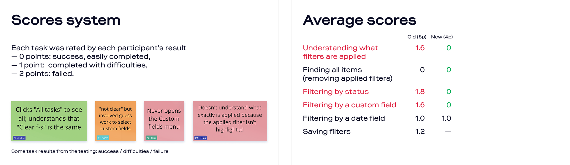
The results of the benchmark testing. Slides from my presentation to the stakeholders
Results & Impact
The new features were an immediate success between the power users, especially the big enterprise accounts. Thanks to the introduction of new date filters, we secured several account expansions and prevented a couple of churn cases.
Since the new filters were introduced, we see an improvement in the new users retention (on average, people spend more days exploring the product while on trial), which our analytics tie with rising conversion to paid accounts. However, I can’t of course be confident that filters alone contributed to this.
Finally, new filters were successfully adopted by other teams and introduced to work in different contexts with different data types: users in admin settings, tasks in automation, widgets in dashboards. They significantly expanded the Automation capabilities and became the foundation of the new Wrike product: Datahub, an Airtable rival.
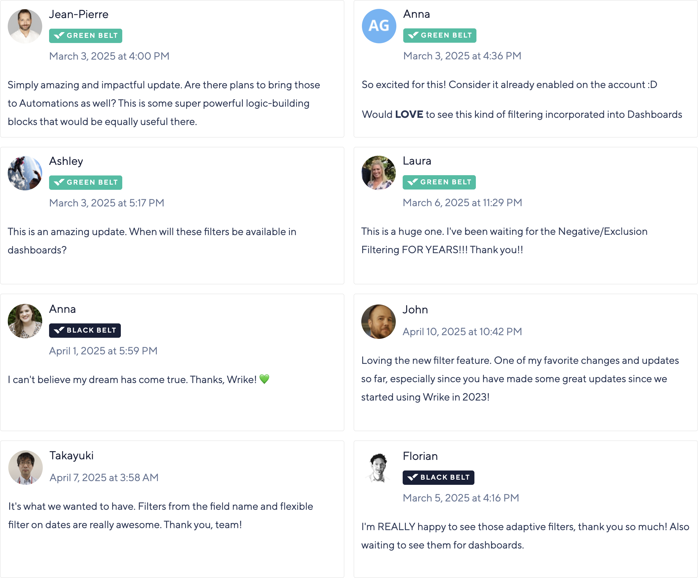
Happy users share their feedback after the beta release, requesting new filters in different parts of the product (which we as happily delivered soon afterwards).